ROC Curves & AUC: Complete Guide (February 2026)
We build classifiers to separate signal from noise, but a single accuracy number hides more than it reveals. Does your model catch 90% of fraud cases while keeping false positives under 1%? Or does it achieve high accuracy by just predicting the majority class? Understanding ROC curves gives you the answer. They plot classifier performance across all thresholds, showing you exactly where your model excels and where it struggles before you deploy it to production.
TLDR:
- ROC curves plot true positive rate vs false positive rate across all thresholds to show classifier performance.
- AUC scores above 0.9 signal strong models; below 0.7 suggests weak discrimination power.
- Use precision-recall curves instead when positive class is under 10% of your dataset.
- Monitor both AUC and threshold-specific metrics in production to catch asymmetric model degradation.
- Openlayer provides 100+ automated tests and real-time monitoring to validate classifier performance at scale.
What is a ROC curve and how does it work
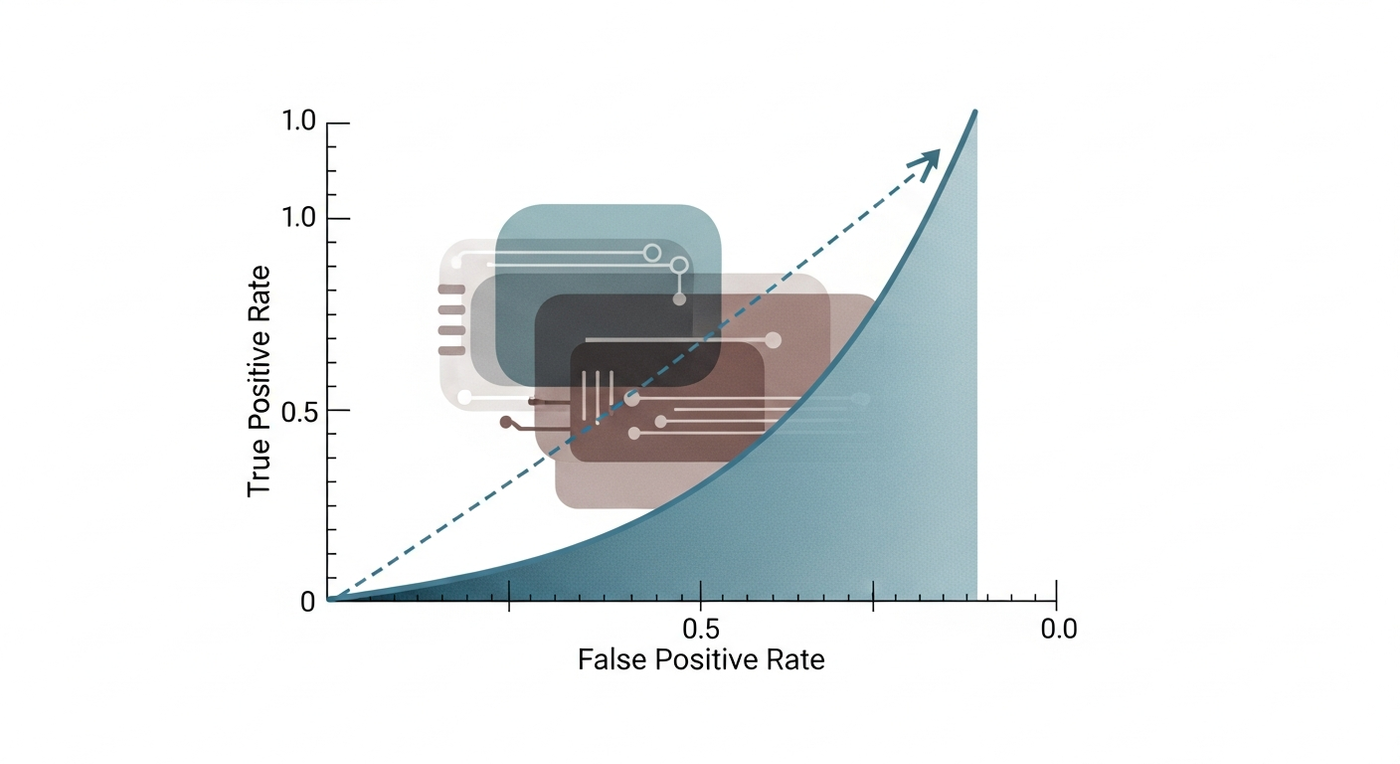
A Receiver Operating Characteristic (ROC) curve plots how well a binary classifier separates classes across all decision thresholds. Electrical engineers coined the term during World War II while analyzing radar signals to detect enemy aircraft. They needed to maximize correct detections while minimizing false alarms. That same trade-off appears in every classifier: catch more true cases, but risk more false positives.
In a ROC curve, the x-axis shows the false positive rate, while the y-axis shows the true positive rate. As you adjust the threshold that determines when a prediction counts as "positive," these rates change, and the ROC curve traces that relationship.
ROC curves are standard in medical diagnostics, fraud detection, and machine learning evaluation. The curve shows every sensitivity-specificity balance your model can achieve. A perfect classifier hugs the top-left corner. A random guess traces the diagonal. Everything in between reveals how much predictive power your model has before deployment.
Understanding AUC (area under the curve)
AUC condenses the entire ROC curve into a single number between 0 and 1. It measures the probability that your classifier ranks a random positive example higher than a random negative one. The key advantage is threshold independence. AUC is one of several ML evaluation metrics that evaluates your model across every possible cutoff, not one operating point. You can compare models without committing to a specific threshold.
Here is a general summary of scores:
- 0.5 means your model performs no better than random guessing
- Below 0.7 suggests weak discrimination.
- Between 0.7 and 0.8 indicate acceptable performance.
- Above 0.9 signal strong predictive power.
- 1.0 represents perfect separation although numbers at or near 1.0 warrant scrutiny for data leakage or overfitting.
To put those scores in perspective, most production classifiers fall between 0.7 and 0.95.
How to calculate and plot ROC curves
Calculating and plotting a ROC curve doesn't have to be hard. Start with your model's predicted probabilities and true labels. Sort predictions in descending order, then iterate through each unique score as a classification threshold. At each step, classify observations above the threshold as positive and compute TPR (true positives / actual positives) and FPR (false positives / actual negatives). Plot each (FPR, TPR) pair.
The good thing is that you don't have to do this by hand! Scikit-learn automates this process. Pass true labels and predicted probabilities to roc_curve, which returns FPR, TPR, and threshold arrays:
from sklearn.metrics import roc_curve, roc_auc_score
import matplotlib.pyplot as plt

fpr, tpr, thresholds = roc_curve(y_true, y_scores)
auc = roc_auc_score(y_true, y_scores)

plt.plot(fpr, tpr, label=f'AUC = {auc:.2f}')
plt.plot([0, 1], [0, 1], 'k--')
plt.xlabel('False Positive Rate')
plt.ylabel('True Positive Rate')
plt.show()
The diagonal line marks random guessing. Any curve above it shows discriminatory power.
Interpreting ROC curves and AUC scores
Once you calculate and plot your ROC curve, you need to interpret that. Below are some general identifies that can help you make meaning of your curve:
- The curve's distance from the diagonal reveals discrimination strength. A bulge toward the top-left corner means your classifier separates classes effectively. A curve that clings to the diagonal suggests the model extracts little signal from features.
- Steep initial climbs indicate high sensitivity at low FPR values. Your model catches many true positives before triggering false alarms. Shallow slopes in early regions mean you pay a high false-positive cost for modest gains in recall.
- Look for the point closest to the top-left corner
(FPR=0, TPR=1). This often approximates the optimal threshold when false positives and false negatives carry equal weight. When costs differ, calculate the Youden index(TPR - FPR)or use domain-specific cost functions to select the operating point that minimizes business impact.
Curves that cross or nearly overlap signal similar overall performance, despite different threshold behaviors. Error analysis in machine learning can help identify which model performs better for specific use cases. One model might excel at high sensitivity, another at high specificity. Compare AUC scores only when curves don't intersect.
ROC curves for imbalanced datasets
There may be times when your dataset is causing an issue. It's important to be able to understand the implication of an unbalanced dataset, where negatives outnumber positives, as it can produce a ROC curve that obscures poor performance. A fraud detection model that flags 100 fraudulent transactions and 1,000 legitimate ones appears strong if 100,000 legitimate transactions exist in the dataset.
The cause of this is a false positive rate (FPR) denominator. FPR divides false positives by total negatives. Large negative classes minimize the metric's movement despite high false positive counts. AUC remains high while precision drops. But, precision-recall curves solve this. Precision divides true positives by predicted positives, reacting to false positives across any class distribution. Apply PR curves when positive rates drop below 10% or false positives carry steep costs. Dealing with class imbalance requires careful metric selection. That's why it's important to only use ROC curves for balanced classes or threshold-independent comparisons.
A quick note: ROC curves vs precision-recall curves
Given that we just mentioned how precision-recall curves can solve when AUC remains high while precision drops, it's important to look into the difference between ROC curves (from which AUC is derived) and those precision-recall curves.
Both metrics assess classifier performance through different trade-offs. ROC curves balance true positive rate against false positive rate. Precision-recall curves balance precision against recall. The difference focuses on how they treat the negative class. ROC curves includes true negatives through FPR. PR curves focus only on predicted positives, ignoring true negatives entirely. When negatives outnumber positives, ROC curves can mask precision problems that PR curves immediately expose. So when should you choose one over the other?
- Choose PR curves when positive class represents under 10% of data, false positives carry high costs, or true negative counts don't inform model utility.
- Choose ROC curves when classes are roughly balanced, both classes matter equally, or you need threshold-independent model comparison across different operating conditions. Understanding model drift vs. data drift helps maintain performance over time.
Threshold selection and optimization

The default 0.5 threshold assumes equal misclassification costs and balanced classes. Evaluating machine learning models beyond aggregate metrics helps identify the right threshold for your use case. For example, cancer screening models should favor sensitivity to avoid missed diagnoses. In another instance, marketing campaigns should favor precision to reduce wasted outreach. What you want to do, then, is find the point that maximizes separation when costs are symmetric. To do that, you can calculate Youden's index (TPR - FPR). On the other hand, for imbalanced classes, use G-mean (sqrt(TPR * TNR)) to balance performance across both classes without bias toward the majority.
Cost-sensitive selection multiplies false negatives and false positives by their business costs, then minimizes total loss. If a missed fraud case costs $5,000 and a false alarm costs $50, weight false negatives 100x higher. Sweep thresholds and compute expected cost at each point.
What's the impact of threshold selection? In production, the choice determines system behavior. Email spam filters favor high precision to avoid blocking legitimate messages. Intrusion detection favors high recall to catch attacks. Your use case determines how you need to optimize threshold selection.
Multiclass ROC curves
One of the challenges lies in multiclass problems because they require binarization before ROC analysis. One-vs-Rest compares each class against all others combined, creating one curve per class. One-vs-One evaluates every pairwise class combination, generating n(n-1)/2 curves for n classes. To tackle these multiclass issues, you can use macro-averaging, which computes AUC separately for each class, then averages the scores, treating all classes equally. On the flipside, micro-averaging aggregates true positives, false positives, and false negatives across classes before calculating a single AUC, weighting performance by class frequency. Both approaches are valid solutions to the multi-class challenges but should be used for specific purposes:
- Apply macro-averaging when minority classes carry equal importance to dominant ones. Complete model evaluation in machine learning considers multiple averaging strategies. Medical diagnosis systems should detect rare conditions with the same rigor as common ones.
- Apply micro-averaging when overall accuracy matters most, or when larger classes reflect true population distribution.
ROC curves in production systems
ROC curves don't play a huge role in production systems. Rather, they are most valuable before or during rollout as they let teams compare models without committing to a threshold, see how aggressively false positives rise as recall increases, and allow them to pick an operating point that matches business cost. But that doesn't mean that you can ignore the ROC curve once the system is in production. Rather, model monitoring in production requires tracking AUC alongside threshold-specific metrics at your operating point. Models degrade asymmetrically. AUC can remain stable while precision at your chosen threshold drops due to distribution shift.
One best practice is to set automated alerts when AUC falls below baseline. A fraud model dropping from 0.88 to 0.82 signals drift or data quality issues. Monitor FPR and TPR independently. Rising false positive rates increase costs even when AUC holds steady.
Another recommendation is to retrain or recalibrate thresholds as populations shift. Seasonal patterns in e-commerce, regulatory changes in finance, and evolving attack vectors in security alter optimal operating points over time.
Common mistakes when optimizing ROC curves
Of course, no approach to model evaluation is perfect and it's easy to make mistakes when trying to optimize a model's ROC curve. For example,
- Comparing models trained on different datasets invalidates ROC analysis. A model with AUC 0.85 on balanced data cannot be directly compared to one with AUC 0.80 on imbalanced data.
- AUC includes regions where both sensitivity and specificity fall below 0.5. These low-performance zones represent confusion matrices that rarely interest practitioners, yet they inflate or deflate scores.
- ROC curves ignore precision and negative predictive value. Two models with identical curves can deliver different precision at the same operating point. Medical screening demands high NPV to reassure patients with negative results, but ROC analysis reveals nothing about this metric.
- Reducing performance to one number erases threshold-specific behavior. A model with lower AUC might outperform at your required specificity level. Proper model validation looks at the full curve and confusion matrix at candidate thresholds. Look at the full curve and confusion matrix at candidate thresholds before selecting a model for production.
Real-world applications across industries
ROC curves have a lot of use across a variety of different industries. We've listed a few below to give you some concrete examples of how they work in real-word situations.
Medical diagnosis
Medical diagnosis systems favor sensitivity over specificity. A cancer screening model operating at 95% TPR accepts higher false positive rates because missing a true case carries catastrophic consequences. Patients tolerate follow-up tests but cannot tolerate missed diagnoses.
Fraud detection
Fraud detection operates under opposite constraints. Credit card systems process millions of transactions daily. A false positive rate of 2% generates thousands of angry customers and support costs. These systems might typically run at 80-85% TPR with sub-1% FPR, accepting some fraud losses to preserve customer experience.
Cybersecurity
Cybersecurity threat detection sits between these extremes. Intrusion detection systems balance alert fatigue against breach risk. Security teams can investigate 50 alerts per day, not 5,000. Critical infrastructure favors high sensitivity despite noise. Corporate networks tune for precision to avoid overwhelming analysts.
Financial services
Financial services clients monitor classification models for drift in both AUC and threshold-specific metrics. A loan approval model degrading from 0.87 to 0.83 AUC might still perform acceptably, but rising false positives at the chosen operating point trigger immediate investigation.
Final thoughts on evaluating binary classifiers
Mastering ROC curve analysis means you can assess classifiers without guessing at thresholds. The curve maps every possible trade-off your model offers. Choose your operating point based on real costs, not defaults. Monitor both AUC and threshold-specific metrics as your data shifts. Your production system depends on understanding these trade-offs from the start.
FAQ
How do I choose the right threshold for my ROC curve in production?
Calculate the cost of false positives versus false negatives in your specific use case, then select the threshold that minimizes total business impact. For symmetric costs, use Youden's index (TPR - FPR); for imbalanced classes, apply G-mean (sqrt(TPR * TNR)); for asymmetric costs, sweep thresholds and compute expected loss at each point.
What AUC score indicates my model is production-ready?
AUC above 0.7 shows acceptable discrimination, 0.8-0.9 indicates strong performance, and above 0.9 signals excellent separation. However, AUC alone doesn't determine production readiness. Assess precision, recall, and false positive rates at your chosen operating threshold, and verify performance on held-out data to rule out overfitting.
When should I use precision-recall curves instead of ROC curves?
Switch to precision-recall curves when your positive class represents less than 10% of your dataset, false positives carry high costs, or true negative counts don't inform model utility. ROC curves can mask poor precision in imbalanced scenarios because the false positive rate denominator minimizes metric movement despite high false positive counts.
Can I compare AUC scores across models trained on different datasets?
No, comparing models trained on different datasets invalidates ROC analysis because class distributions, feature spaces, and sampling methods affect AUC independently of model quality. Only compare AUC scores for models assessed on the same test set with identical class distributions.
How do I monitor ROC curve performance after deployment?
Track both overall AUC and threshold-specific metrics (precision, recall, FPR) at your production operating point. Set automated alerts when AUC drops below baseline or when false positive rates rise, as models can degrade asymmetrically AUC may hold steady while precision at your chosen threshold deteriorates due to distribution shift.